Analytics Hub
A platform enabling users to efficiently monitor and oversee business progress, while identifying areas in need of enhancement.
Context
Redesign the Analytics hub in such a way that it is user friendly, easy to understand, has a light user interface and a smooth transition.
Problem

The system lacks a seamless experience for end to end reporting and sharing of data.
Managing the data has become nearly impossible.

The data representation is weak, making it difficult to identify areas of success, improvement and monitoring.

Objective
Research, Strategise and Design end to end experience that help users to to effectively monitor and manage the progress of the business, while also identifying the areas that require improvement.
Project Kick-off
Essential phases of the design process was outlined to grasp the project, established an MVP and to devised solutions to better comprehend the fit of the project with it’s users.
1.Discovery
2.Define and Ideate
3.Design Iteration
Lacked understanding in users, wants, needs and expectation, so needed to find :
-
Users current frustrations and Pain Points?
-
What did users really want?
-
What did users really need?
So we began by conducting primary and secondary research.
Discovery
Primary and Secondary Research
These actions were undertaken for research purposes.
1. Competitive Analysis
2. 8+ Interviews
3. Contextual enquiry - domain training
1.Competitive Analysis
Competitive analysis was crucial to meet user expectations and deliver a user-centered, distinctive product that adds value to both users and businesses. We evaluated two to three business analytics tools, consolidating their findings into a comprehensive list.
2.User Interview (Face to Face Session)
Competitive analysis was crucial to meet user expectations and deliver a user-centered, distinctive product that adds value to both users and businesses. We evaluated two to three business analytics tools, consolidating their findings into a comprehensive list.
To effectively conduct user interviews and gather valuable insights to guide UX design decisions, we followed a structured approach that included:
-
Defining Interview Objectives
-
Preparing Interview Questions
-
Conducting Pilot Testing
-
Thorough Analysis
Interview Objective
The user interview goals and objectives are established, and the specific information or insights we sought included:
-
Gaining insights into the most crucial Key Performance Indicators (KPIs) our users wish to access and comprehending the hierarchy of information they require.
-
Understanding the scenarios in which our users will utilize the new tool and identifying additional features like reporting and sharing that we can provide to them.
-
Exploring the user experience with Analytics Hub.
Interview Questions
A well thought-out list of open ended questions that align with research objectives was prepared and categarised into different category of questions.

Pilot Testing
A pilot interview was conducted with one of the stakeholder to refine the Questions and to ensure the interview flow is effective and then the main user interviews were taken.
Key Takeaways From Interviews
Analysis
Interview data & Insights was analysed and categorised into four parts.
1. Data Reporting
-
Analysing data and pinpointing the issue is challenging.
-
Tower level to portfolio data is required.
-
A tool should serve both as a reporting and an analysing tool.
-
One dashboard is required to view all KPIs
2. Data Extraction
-
Multiple source of system for extracting data or KPIs.
-
Different tools are used to collect and compile the data.
-
Integration from source itself to reduce the data intervention.
3. Navigation
-
Advance Search
-
Proper Drill-down
4. User Access
-
Content and Functionality based on user access and role
Additionally, We comprehended how users interacted with the tool.
3.Contextual enquiry - domain training
Domain Training was important to acquire knowledge about the structure of the “Analytics Hub” in which users operate. This helps us to understand the user’s domain terminology and challenges, allowing us to design a more effective user-centered design
Information Hierarchy of Analytics Hub
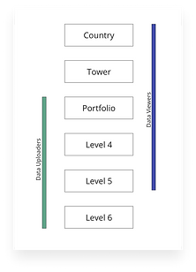

In the above Information Hierarchy, the data is flowing via data uploader at every level which is a lot of manual work for data uploader.
Ideal Information Hierarchy of Analytics Hub
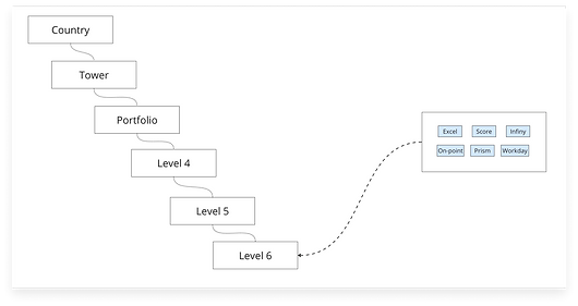
Ideally, data should flow directly from the data source, eliminating the need for any intermediary.
Overwhelmed with insights, we needed to start prioritising to form a strategy
-
Understand Key Pain-points, wants and needs
-
Classify all insights gathered
-
Present our synthesis to stakeholders
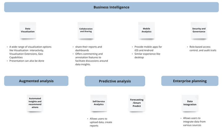
Define and Ideate
Jumped further to form strategy and experience we sketched out-
-
User Personas
-
Affinity Maps
-
Impact and Efforts Metrics
-
User Flows and Information Architecture
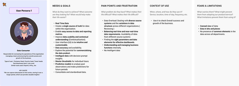
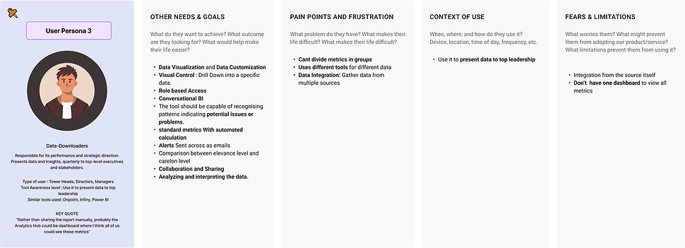
1. User Persona
Divided User persona into four user groups
-
Data consumer ( Company Head, Country head, Tower heads)
-
Data uploader ( Portfolio Managers, POCs)
-
Data Downloader (Tower Heads, Directors, Managers)
-
Admins (Tool manager)
Data consumer (Company Head, Country head, Tower heads)
Data uploader ( Portfolio Managers, POCs)

Data Downloader (Tower Heads, Directors, Managers)
Admins (Tool manager)

2. Affinity Map
The information gathered was grouped based on the similarities which helped in revealing patterns and insights for better design decisions

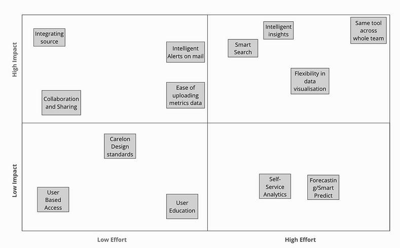
3. Impact and Efforts Metrics
The information gathered was grouped based on the similarities which helped in revealing patterns and insights for better design decisions
4. Information Architecture

After wrapping up the discovery, define and ideation phases, the design iteration process was initiated right away.
-
Wireframes were made
-
Focus on navigation and data representation
-
Branding and Identity
Design Iteration
The design iteration process was broke down into smaller steps to manage the extensive data representation.
Iteration Process started with :
-
Low fidelity wireframes : Focus on navigation and data placement for quick exploration
-
Visual Representation : Cards and graphs of different set of data and Tables for complicated excel data
-
High Fidelity Wireframes
1. Low fidelity wireframes
2. Visual Representation for Cards and graphs
Upon card finalization, it was crucial to assess whether the visualization aligned well with various data sets.
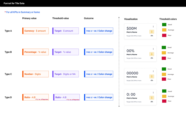
Final Card and Graph Design
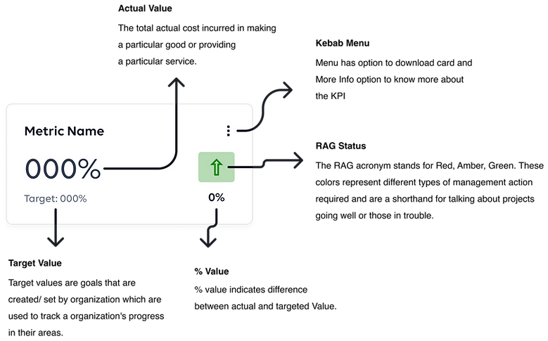
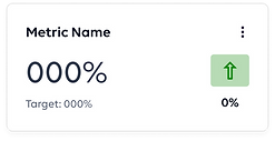
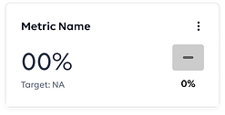
Card Elements
Different Cards
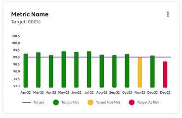
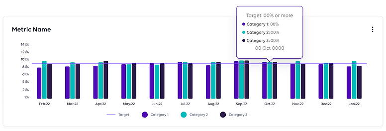
Graph Elements

Different Graphs

3. High Fidelity Wireframes
After multiple design iterations, we arrived at a finalized high-fedelity design that adheres to the company’s design language.
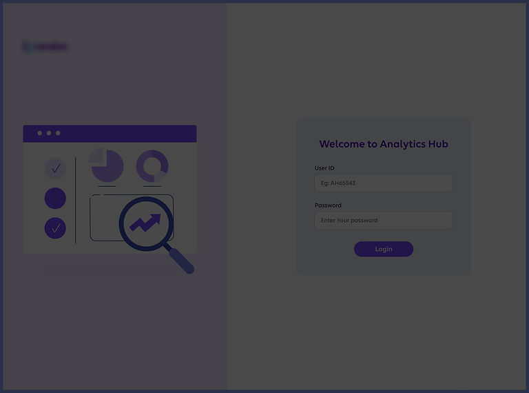
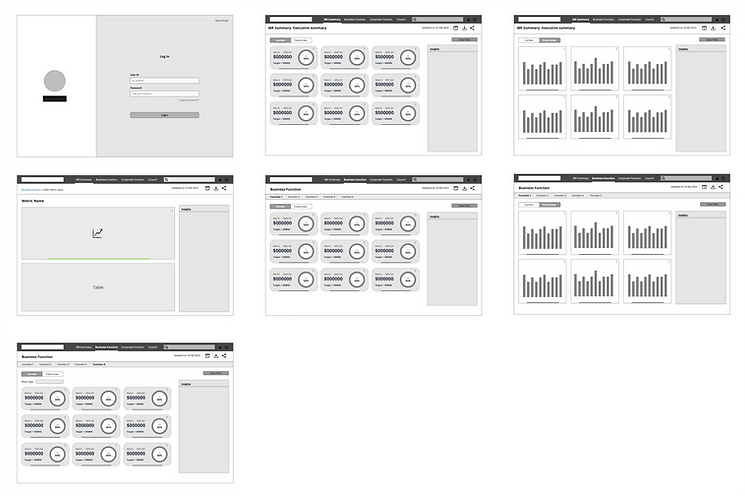
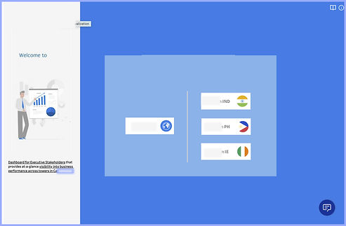
Screen 1 : Log In Screen
Before
Open Access: No restricted data; anyone can log in.
After
User-Based Access: Ensuring data privacy within the organization.

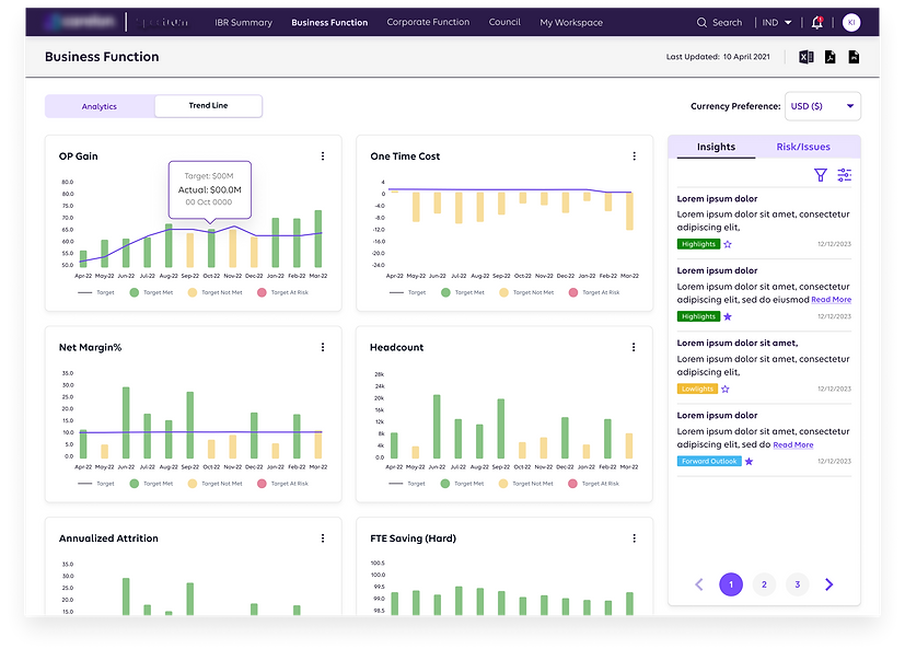
Screen 2 :Tile Data Display
Before
-
A substantial data overload on a single page results in cognitive load, impeding the acquisition of clear insights.
-
Inconsistencies are noticeable in design.
-
Aesthetics and a minimalist design approach are absent.
-
Switching between data sets involves a lengthy and cumbersome process.
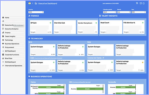
After
-
Country-level data is readily accessible and easy.
-
Users have the option to download the data.
-
Clear, detailed insights are provided, using tags such as "Highlight," "Lowlight," and more.
-
Consistency and design standardization have been successfully implemented.
%20(2)%201.jpg)
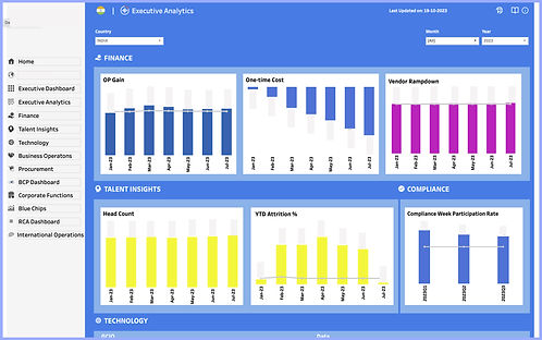
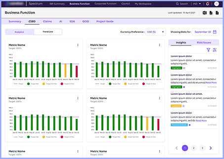
Screen 3 : Graphs Data Display
Before
Aesthetics and Minimalist Design is missing
After
Consistency, Aesthetics and Minimalist Design
%201.jpg)
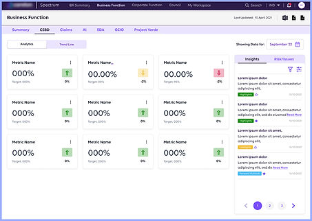
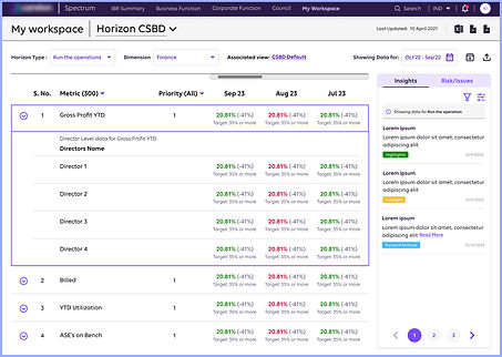
Screen 4 : Table Data Display
Before
The cognitive load when navigating through the data is overwhelming, making it excessively complex and challenging to derive insights from the table.
After
A straightforward data flow, accompanied by relevant insights on the right, simplifies data consumption for users.
Learnings
Developing a business analytical tool empowers organizations to gain a deeper understanding of their operations, customers, and the market, leading to data-informed decision-making and improved overall performance. Through out the project I learned about:
-
KPI: key performance indicators (KPIs) which are most relevant to a business.
-
Data Insight via business tool: Analyzing data using the tool can reveal patterns, trends, and correlations, providing valuable insights into business performance.
-
A business analytical tool can effectively eliminate the manual upload and reload work associated with showcasing leadership data in Real-Time Data Updates, Data Centralization, Custom Dashboards, User Permissions, Data Quality Assurance, Scalability, Time Savings