Analytics Hub
A business analytics solution designed to help enterprise leaders monitor performance, improve efficiency, and make informed decisions. The platform provides real-time insights, dashboards, and data visualizations tailored to different user roles.

Collaboration Overview
Role
UX Designer
Duration
12 months
UX Team
1 Lead UX Designer, 2 UX Designers
Collaborators
Product Manager, Business Stakeholders, Development Team
Problem
The existing analytics system failed to deliver a cohesive and insightful experience, making it challenging for users to manage, interpret, and share business data effectively.
Lack of Unified Reporting Flow
Users are forced to switch between multiple tools, creating a fragmented and inefficient reporting experience.
Weak Data Visualization
Cluttered and inconsistent visual representations prevent users from easily identifying trends, patterns, and performance gaps.
Scattered Data Sources
Disconnected datasets make data management complex, reducing trust and making it nearly impossible to maintain accuracy.
Heavy Manual Dependency
Frequent manual updates and repetitive data uploads make the workflow slow, error-prone, and difficult to maintain.
Business Goals
- Transform complex data into clear, actionable insights
- Increase user trust and platform credibility
- Ensure data privacy and regulatory compliance
- Enable role-based, controlled data access
- Strengthen decision-making confidence across teams
Project Brief
The Analytics Hub redesign aimed to transform a fragmented, data-heavy system into a unified, user-centric analytics platform. During Empathy & Discovery, the team conducted competitive analysis, 8+ user interviews, and contextual research to understand how users interact with data, what KPIs they need, and where current workflows break. Key insights revealed the need for a centralized dashboard, automated data integration, clearer navigation, drill-down capabilities, and role-based access. In the Define & Ideate phase, the team translated research into personas (consumer, uploader, downloader, admin), mapped insights through affinity diagrams, prioritized features using an impact-effort matrix, and designed user flows and information architecture to clarify data movement and user journeys. During Design Iteration & Prototyping, they created low-fidelity wireframes, explored data visualization patterns (cards, graphs, tables), and developed high-fidelity screens with consistent UI, secure user-based login, tile-based dashboards, improved charts, and clear download/reporting options. These iterations focused on reducing cognitive load and enabling fast, insight-driven decision-making. Overall, the redesign turned a complex reporting system into an intuitive, role-aware analytics tool that supports clarity, efficiency, and better business decisions.
Key Focus Areas
Turning Insights into Design
The design evolved through multiple iterations — from wireframes to refined interfaces — emphasizing clarity, scalability, and usability.
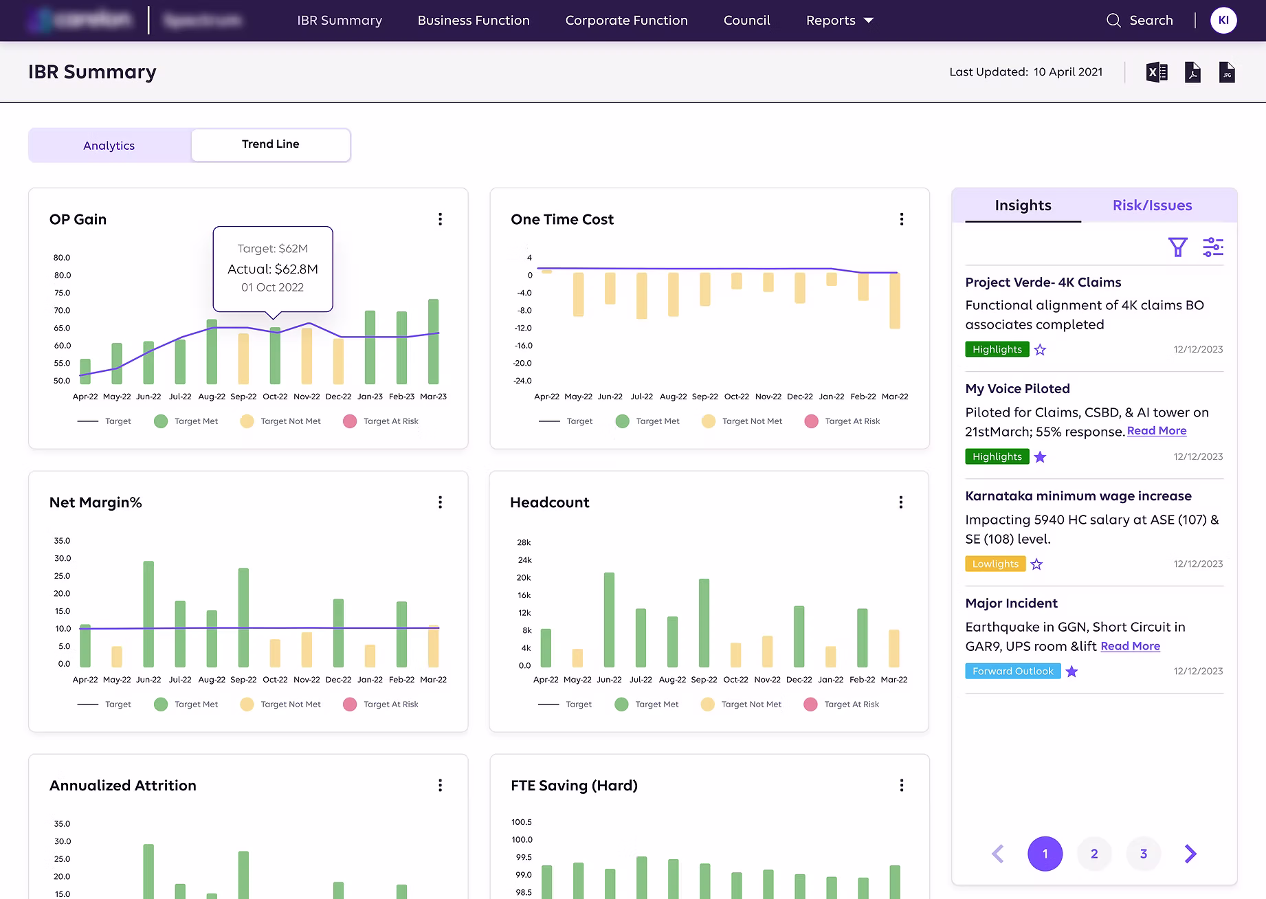
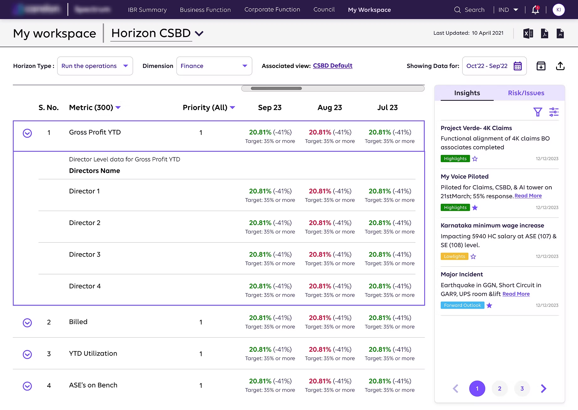
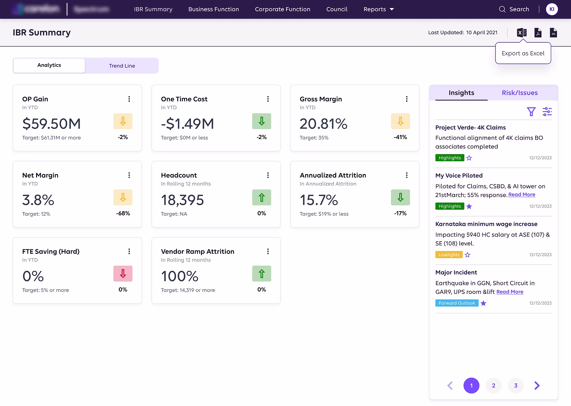
Data Visualization
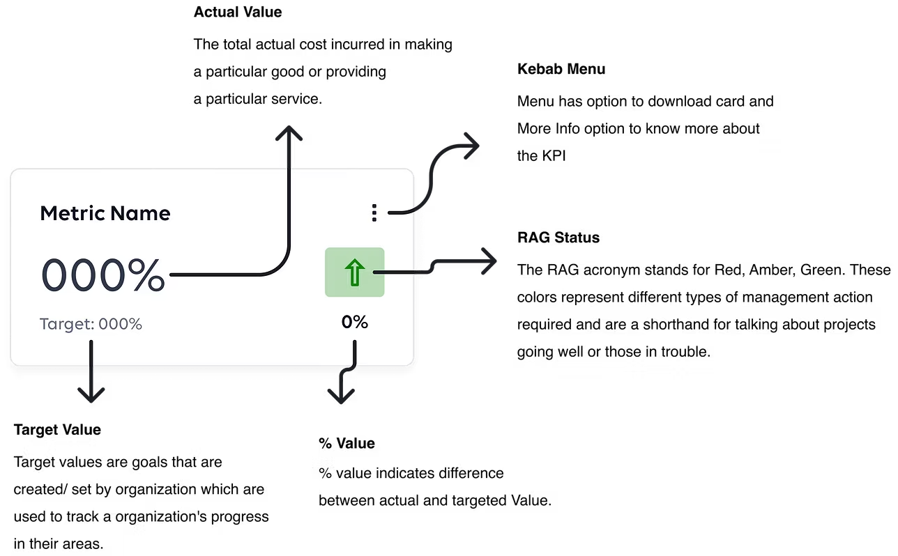
Card Elements
Modular card-based components to display key metrics and insights at a glance
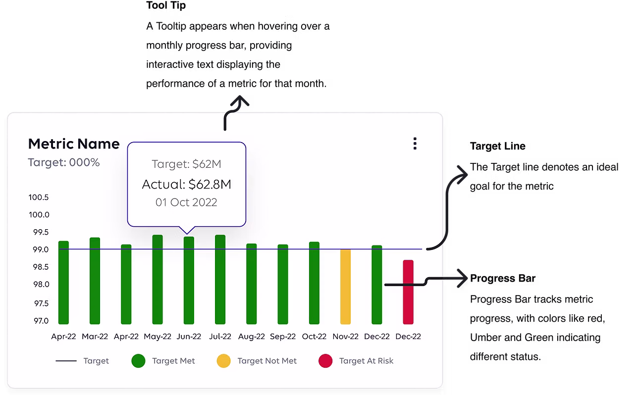
Graph Elements
Interactive charts and visualizations for trend analysis and data comparison
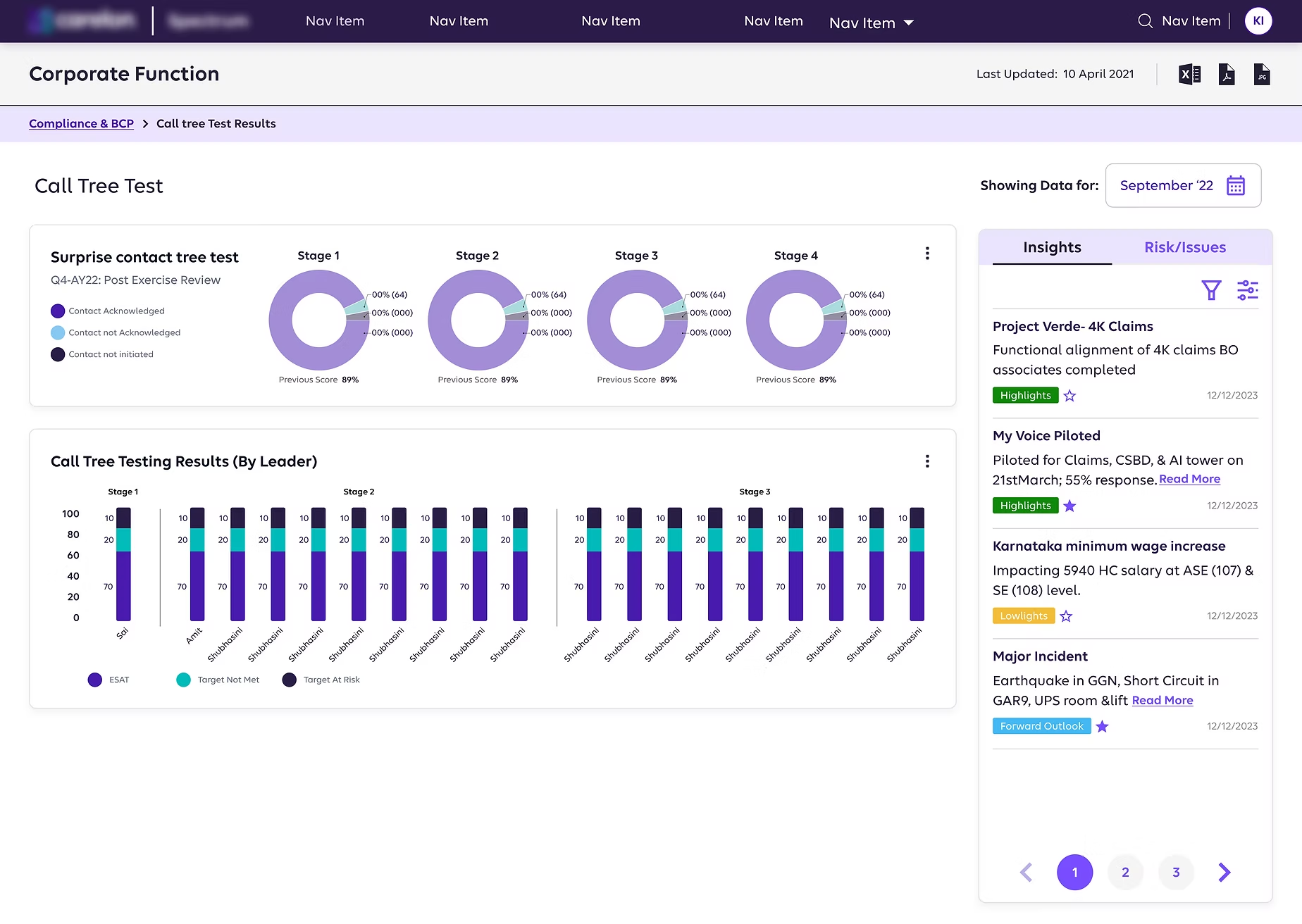
Final Screens
High-fidelity prototypes showcasing the complete user experience across different roles and scenarios
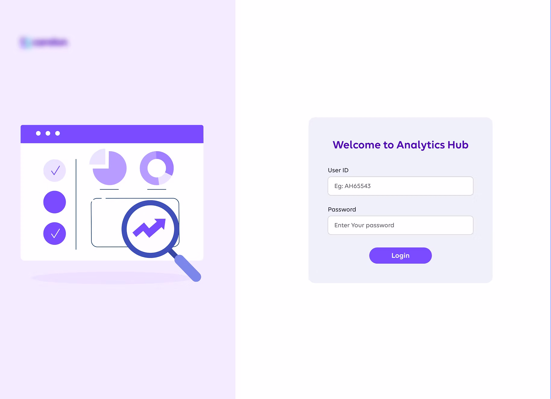
Analytics Hub Login Screen
1 / 5
Impact
Adoption & Efficiency
Weekly adoption within 2 months
Reduction in report generation time
Faster decision turnaround
Security & Governance
- Role-based access control with secure data visibility
- Automated data validation improving accuracy and trust
Operational Improvements
- Real-time automated data updates (eliminated manual uploads)
- Centralized data platform reducing fragmentation
- Custom, role-based dashboards focused on relevant KPIs
Business Outcomes
- Faster quarterly reviews and improved performance monitoring
- Reduced operational costs
- Increased data-driven decision-making and user trust
- Scalable platform supporting long-term growth
Next Project
Insurebot
A chatbot designed to assist healthcare professionals in retrieving patient insurance details.